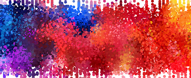
Improve Your Signs With Color
Use The Right Color on Your Signs
There are a lot of studies that show psychological associations between colors and emotions. This is important to keep in mind when designing your business signs to maximize their effectiveness.
For example, a spa wouldn’t choose passionate, energizing red to promote the serene, relaxation it offers. Instead this spa would use blue which has calming qualities, making it a better color choice. Studies also show it is more important to match the color to the intended personality of the business, rather than stereotypical color associations. This stems from the fact that many colors have multiple associations that are not always closely related.
For example, brown can be related both to the color of dirt and ruggedness or the color of thanksgiving and warmth. If you were choosing brown for its warm qualities but the business personality was energizing and creative, orange might be a better color choice.
Unordinary Color Choices and Their Meanings
In a previous post, we talked about the most popular colors and their psychological associations, but here are a few more commonly used colors in signs:
Brown
Brown is associated with ruggedness, dirt, and the outdoors. Making it dependable and reliable. UPS wants you to feel assured that your packages will be received safely and on time. However, brown is also deeply associated with nurturing qualities and warmth because of the color’s ties to Mother Earth. Brown is the color of thanksgiving, a day of gratitude, family, and love.
Pink
Pink is obviously associated with femininity and girliness. Girls toys, like Barbie, capitalize on this and feature a pink logo to create a feeling of warmth and sweetness.
However, pink is also associated with romanticism and sexuality. This quality of the color is not lost on brands like Victoria’s Secret who are looking to appeal to a woman’s flirtier side.
White
White is associated with cleanliness, freshness, and purity. Many hospitals use white to emphasize the sterility of their facilities.
Brides wear white to emphasize their youth and purity. White can also be used as a contrast color on your sign because it complements every color on the spectrum.
Gray
Gray is associated with neutrality, stability, and professionalism. Apple features a gray or silver apple with gray highlighting their professionalism and silver highlighting their focus on the future.
Gray is also associated with compromise and a dignified feeling which is why many law firms utilize gray in their branding. They want their clients to see them as professional and stable but ultimately capable of getting the best deal through compromise.
Keep Your Sign’s Intended Audience in Mind
Depending on your target audience, you might want to take gender color preferences into account. For example, if your targeting men but using the color pink, you might be limiting the effectiveness of your sign. However, if you’re targeting women and promoting a beauty brand, using pink would enhance your sign’s effectiveness over a gender neutral color.
Both genders have different preferences and dislikes when it comes to color. While men’s most disliked color was brown, women’s most disliked color was orange. While many women select purple as their favorite color, very few men do. One color the gender’s agree on is blue. Blue is very popular with men and women making it a great color for gender neutral brands and businesses.
Studies have also shown that men prefer bright colors while women prefer soft colors, and men prefer shades while women prefer tints. Since shades are colors with black added and tints are colors with white added, the commonality is men prefer darker colors while women prefer lighter ones.
Using Signs & Color To Improve Business
When designing either an outdoor sign or an indoor sign, it’s important to keep the personality of your brand in mind along with your sign’s intended audience. While signs can be an effective way of increasing revenue, if poorly designed, they may not deliver maximum benefits. A well designed sign that keeps color psychology in mind can greatly improve your business.